Brand Assets
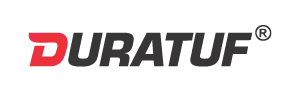
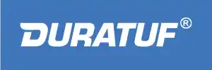
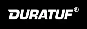
The Duratuf logo visually represents the brand’s core values of durability, toughness, and reliability.
Curved 'D' Design :- The unique, forward-leaning curved 'D' symbolizes momentum, agility, and strength. It highlights Duratuf’s progressive approach and adaptability in the industrial rubber sector.
Red (D in Duratuf) :- Symbolizes strength, energy, urgency, reflecting the brand’s dynamic and action-oriented approach. The color strongly evokes power and resilience.

Modern and geometric, conveying innovation and a forward-thinking approach.
Designed for readability on screens, ensuring clear communication across digital platforms.
Timeless, clean, and highly legible, perfect for industrial reliability.
Font Usage Guidelines:
Digital Media: Use Poppins and Overpass fonts for all digital platforms, ensuring consistency in web and screen-based materials.
Print Media: Employ Helvetica for all printed materials to uphold a cohesive and professional appearance.
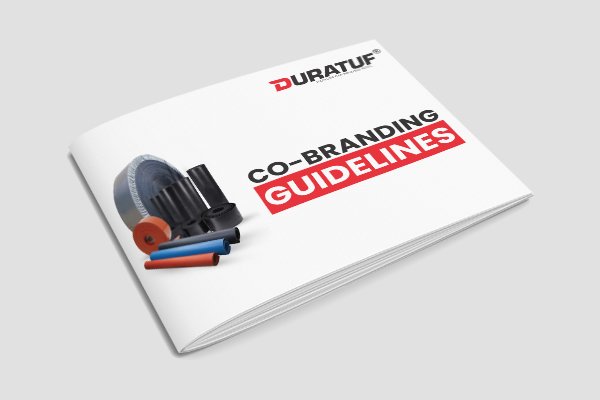
Our Channel Partner Branding Guidelines are designed to help you represent the Duratuf brand accurately and professionally across all marketing and communication channels. Whether you're creating product brochures, social media content, signage, or digital campaigns, these guidelines ensure that your messaging aligns with our brand identity.
What’s Inside the Branding Guidelines:
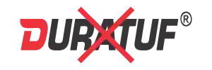
- Logo Usage: Clear instructions on logo placement, spacing, and size for various formats
- Color Palette: Primary and secondary brand colors with codes
- Typography: Approved fonts and usage hierarchy for print and digital materials
- Imagery & Graphics: Guidelines on using product images, icons, and branded visuals
- Co-branding Rules: How to correctly use your identity alongside Duratuf branding
- Tone & Voice: Key messaging principles for consistent communication
Note:- All marketing collaterals must be shared with Duratuf for prior approval before external use.